01 · Intro
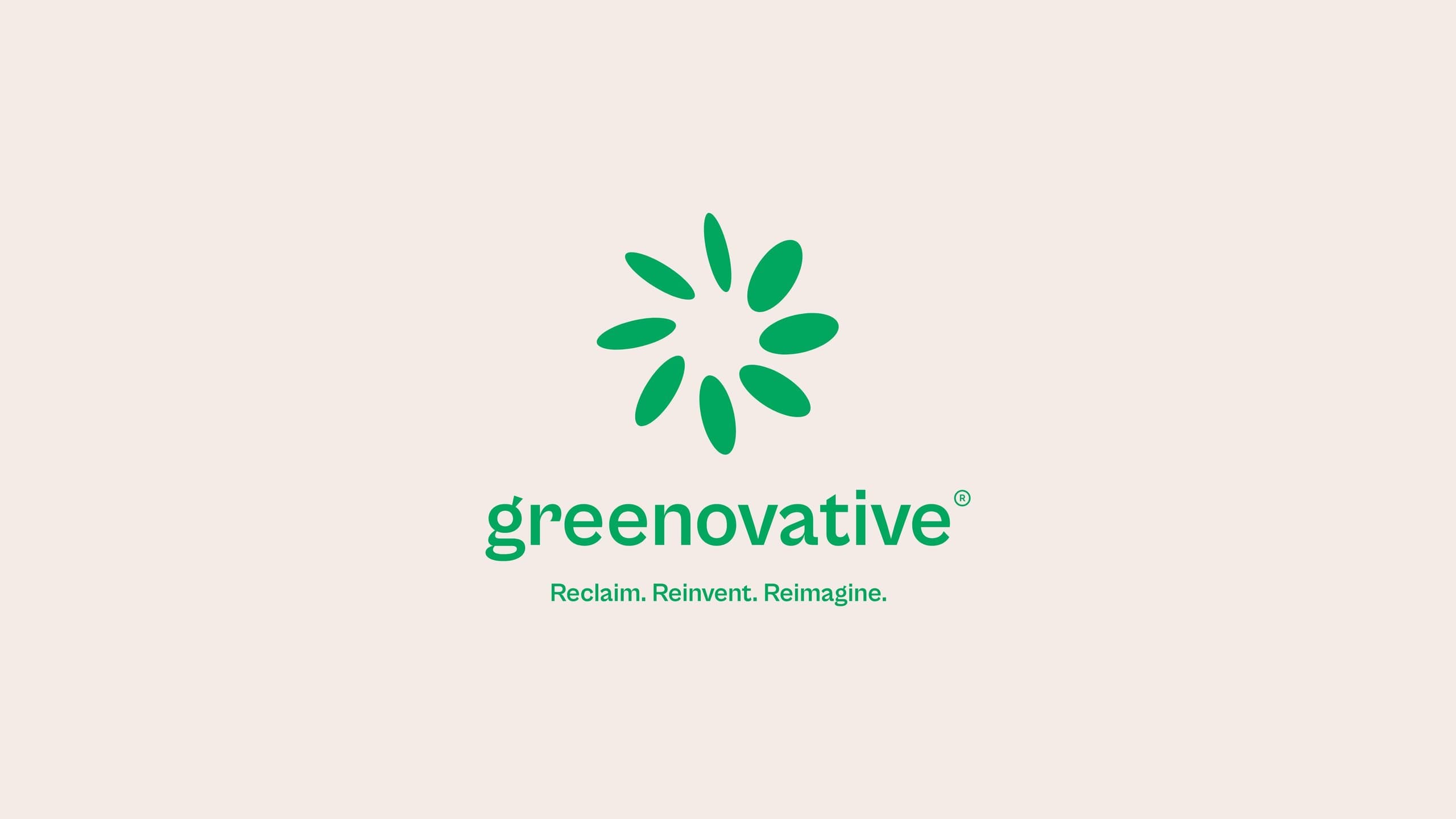
Greenovative exists to give plastic a second life. It collects plastic waste, recycles it through certified processes, and returns it to everyday life as useful materials and products. Makers was brought in to build a brand that could carry that mission: credible enough for industry partners, warm enough to rally communities, and simple enough to live on a recycling bin as easily as on a website.
- Client
- Greenovative
- Location
- Dhaka, Bangladesh
- Industry
- Plastic recycling & circular economy
- Year
- 2025–2026
- Services
- Brand strategy, logo design, visual identity, website UI, social campaign, brand collateral
- Website
- greenovative.bd
02 · The challenge
Recycling has an image problem.
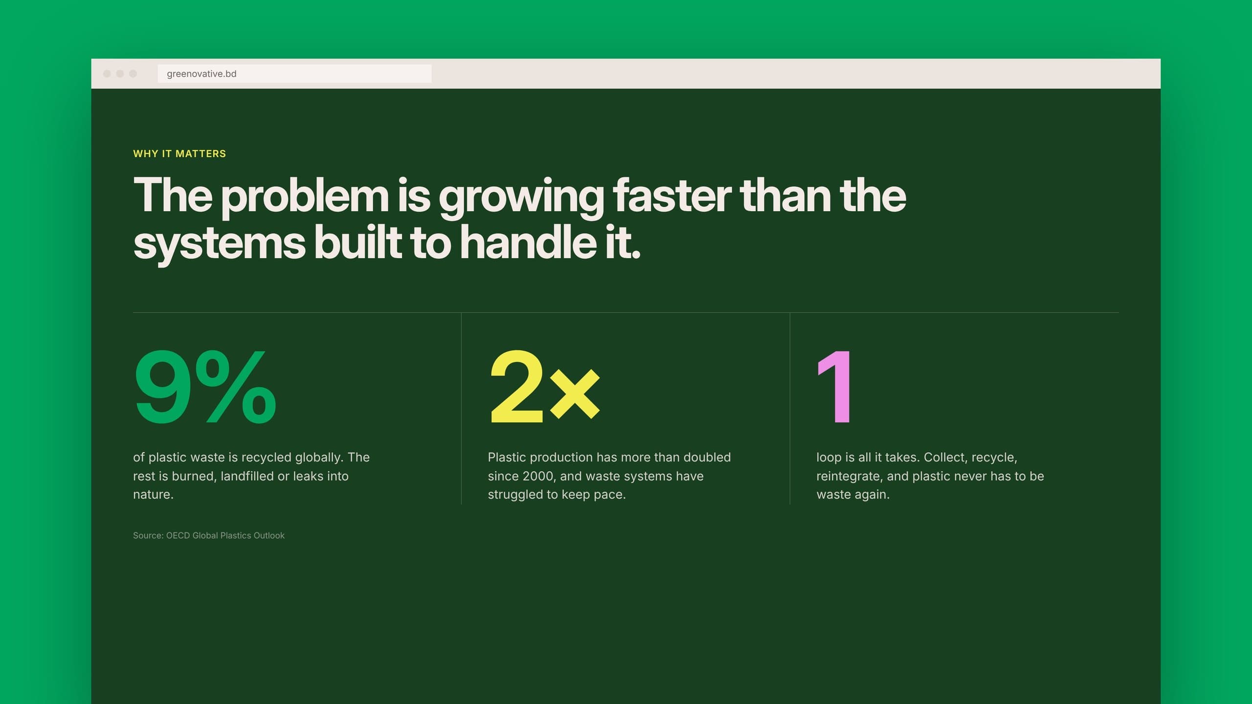
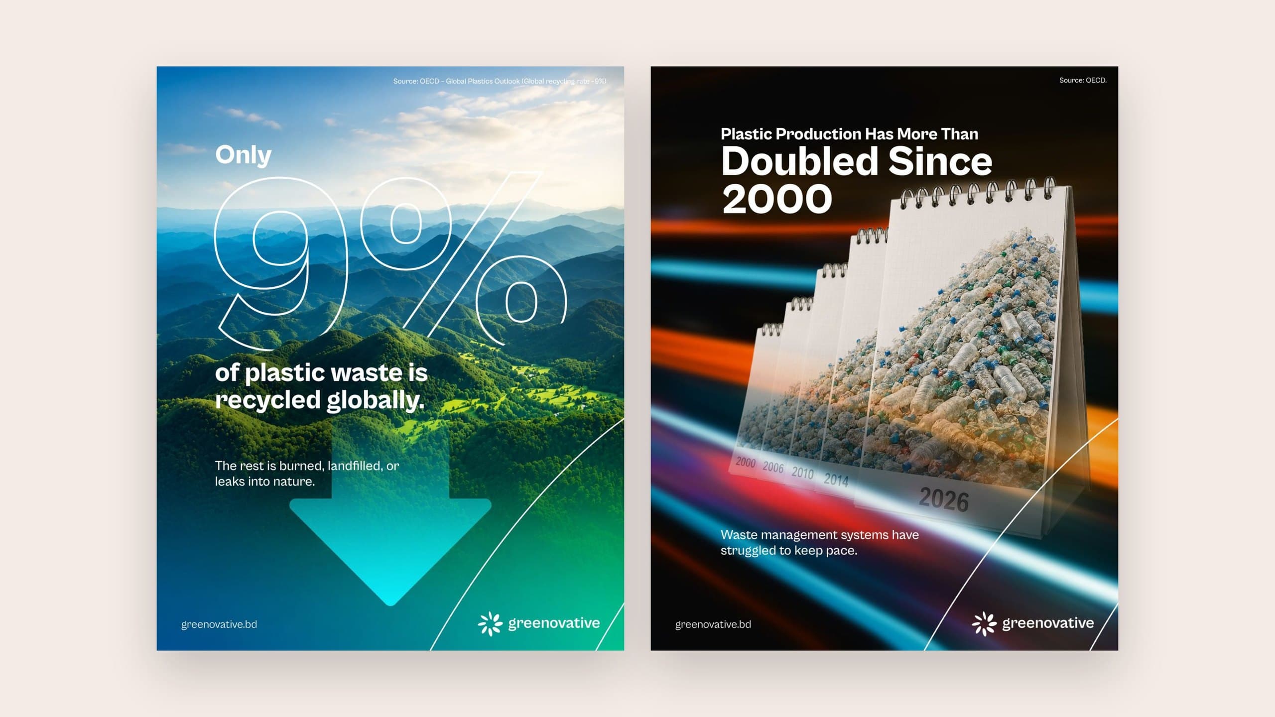
Only around 9% of plastic waste is recycled globally, and production has more than doubled since 2000. In Bangladesh, plastic clogs rivers, drains and coastlines. Most recycling brands answer this with guilt: grey imagery, heavy warnings, endless arrows. Greenovative needed the opposite. A brand that makes recycling feel optimistic, modern and worth joining.
03 · The idea
From scattered flakes to a bloom.
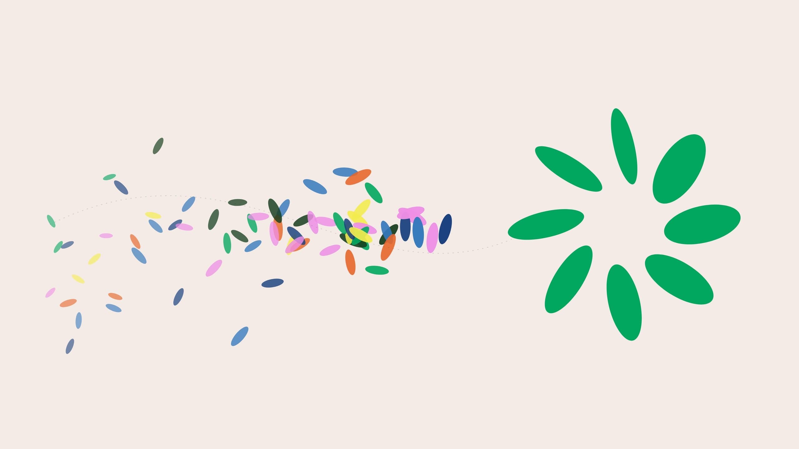
When plastic is recycled, it is shredded into small flakes of every colour. We took that raw, chaotic moment and gave it a direction. Eight flakes gather and turn around a shared centre, forming a bloom. It reads as a flower, a sun, a spinning cycle. Waste, reorganised into life. The name finishes the thought: green, plus innovative.
04 · The mark
Built on a circle, designed to move.
The symbol is drawn on a radial grid. Eight petals are placed at 45° steps, each slightly varied in size and angle so the mark feels organic rather than mechanical, as if it is mid-rotation. That sense of motion is the circular economy in one shape. The wordmark is a friendly, lowercase sans with an open, rounded rhythm, paired with the brand line: Reclaim. Reinvent. Reimagine.

05 · Colour
The colours of a cleaner Bangladesh.
Greenovative Green leads, grounded by Deep Forest and lifted by Recycled Paper, a warm off-white that echoes reclaimed material. Around them sits a supporting palette drawn from the landscape and from the bright, mixed colours of sorted plastic: River Navy, Monsoon Blue, Sun Lemon, Bloom Pink and Clay Orange.
- Greenovative Green#02A75F
- Deep Forest#183F20
- Recycled Paper#F4EBE6
- River Navy#19417E
- Monsoon Blue#3579BD
- Sun Lemon#F3EC4F
- Bloom Pink#EE8FE5
- Clay Orange#E7662B
06 · A flexible system
One mark, many surfaces.
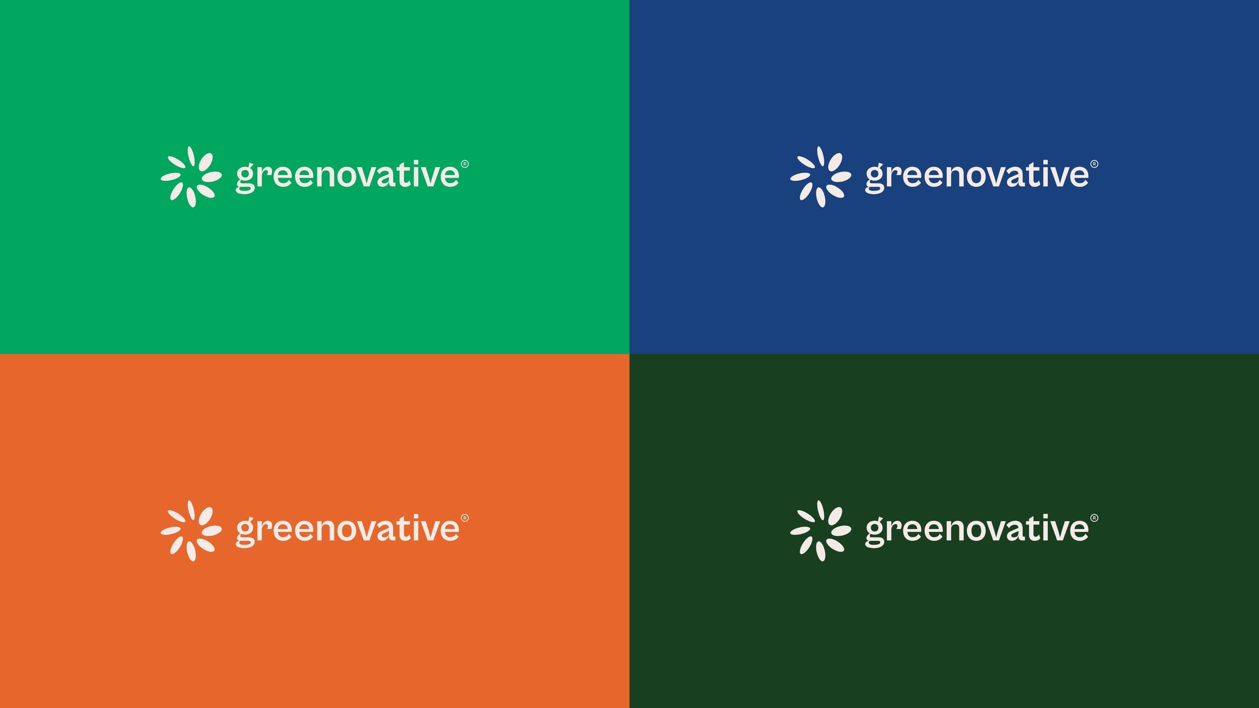
The horizontal lockup holds its own on every colour in the palette. Repeated and rotated, the symbol becomes a quiet tone-on-tone pattern for packaging, backgrounds and merchandise. Two thin sweeping lines, borrowed from the motion of the petals, run through layouts as a signature graphic device.
07 · Website
A website that explains the loop.
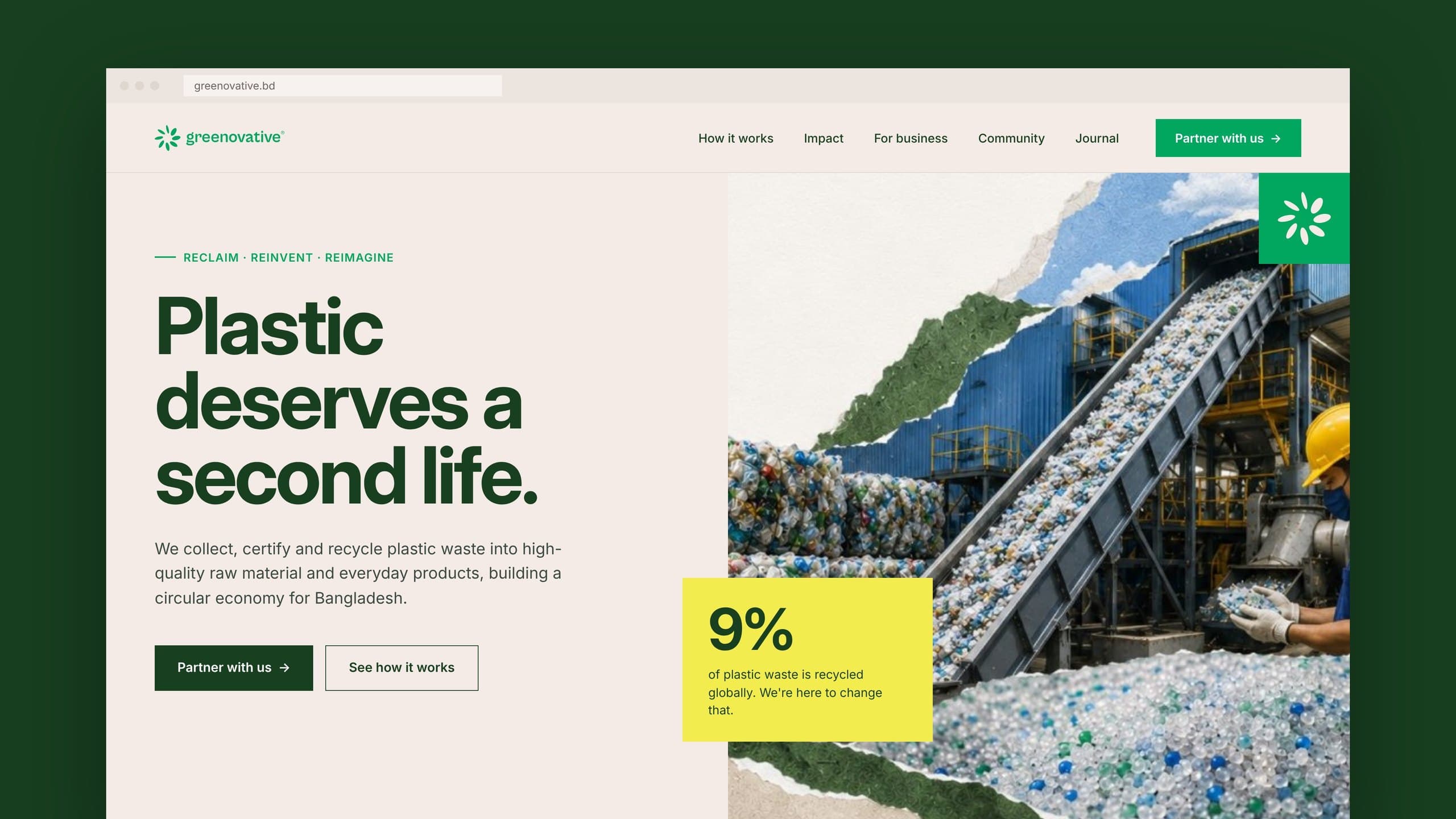
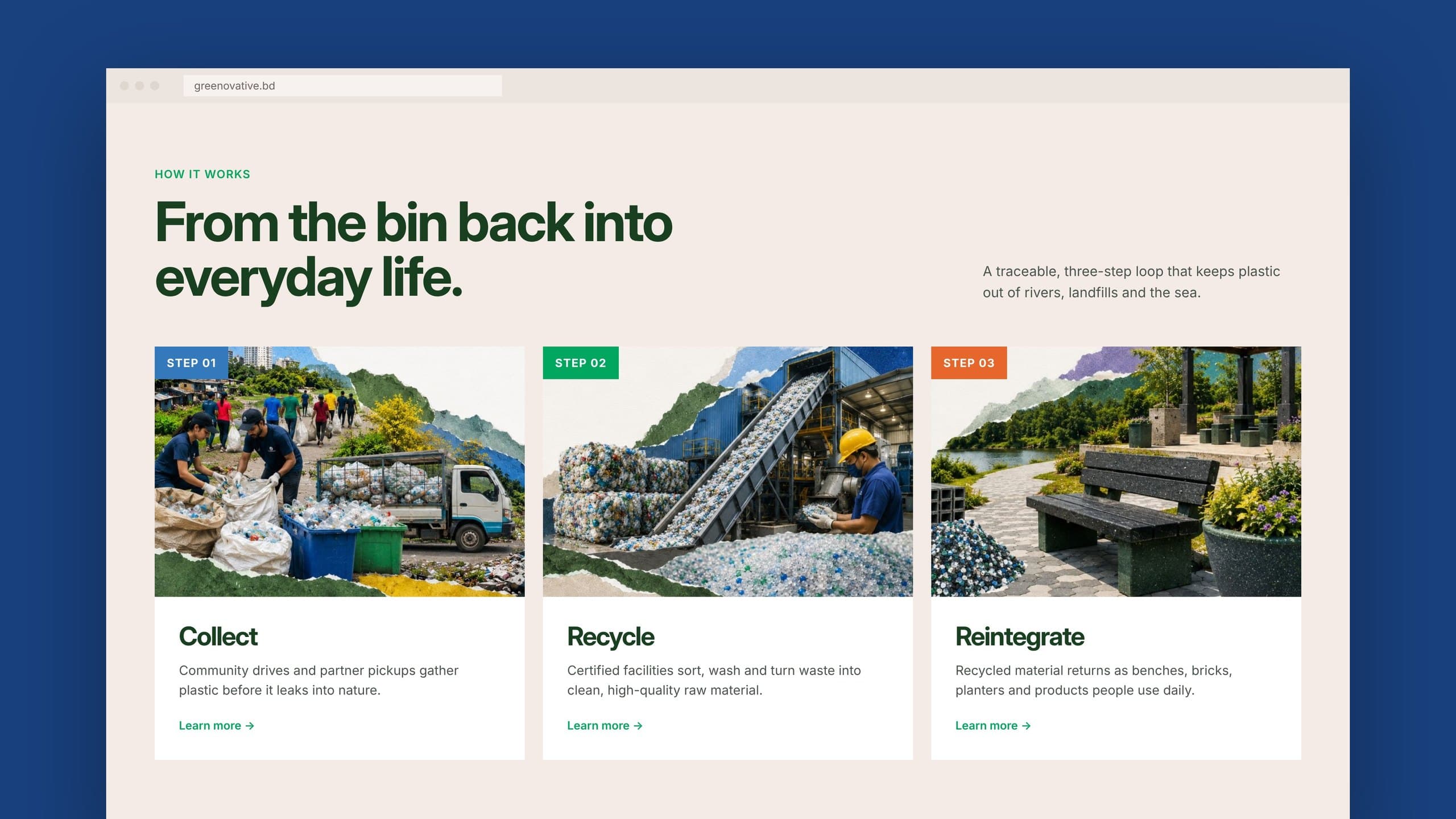
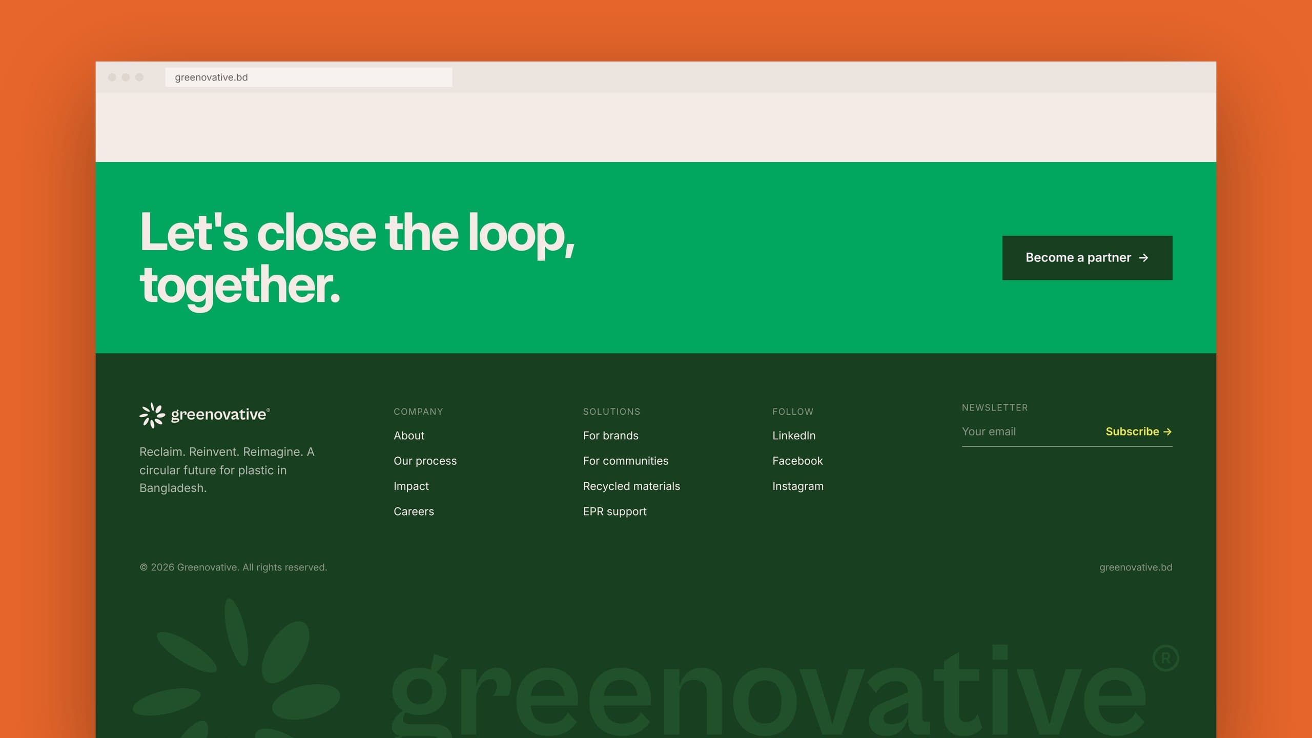
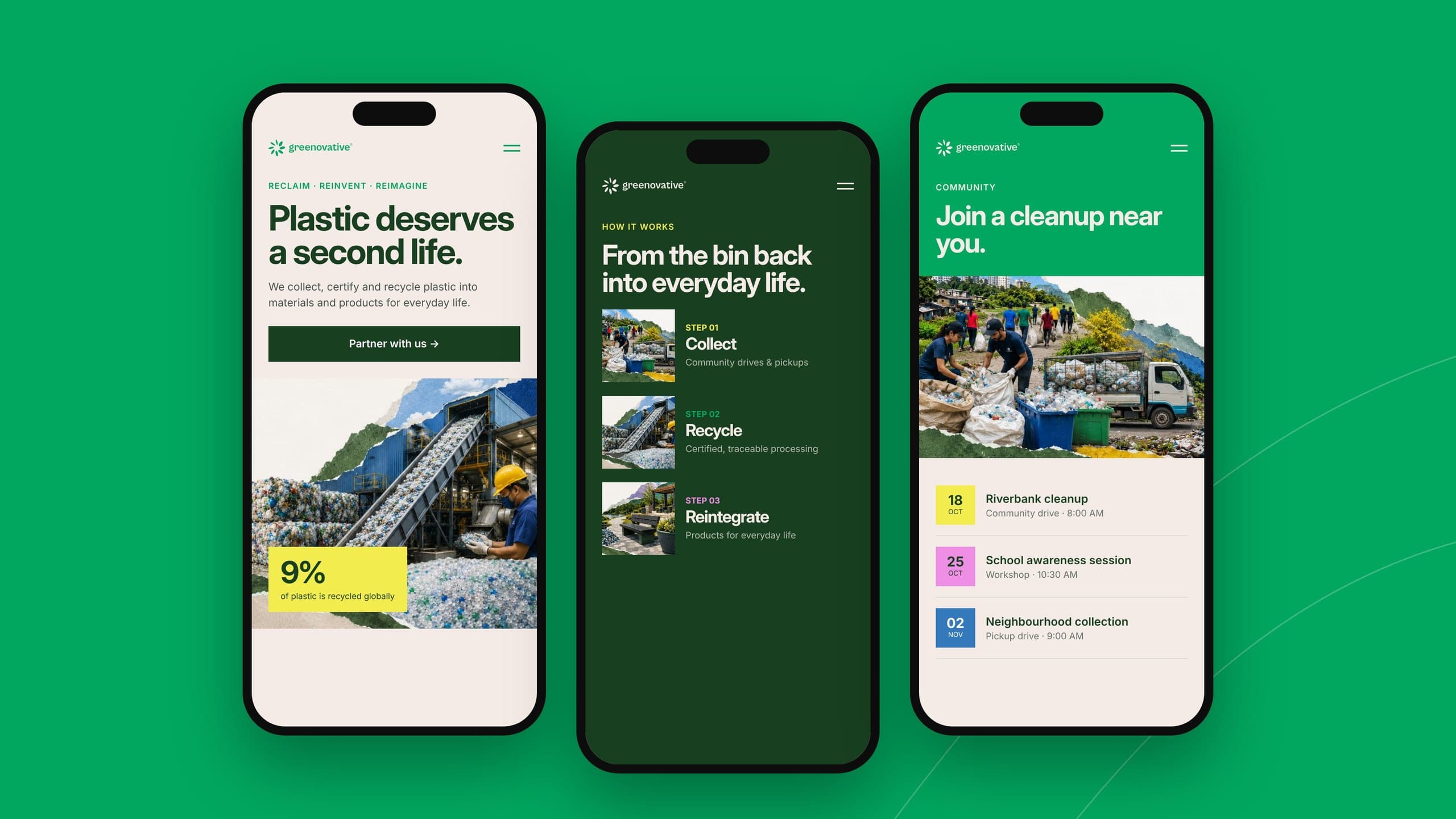
The site is built around a single story: where plastic goes, and how Greenovative brings it back. The hero states the promise plainly. A three-step journey (Collect, Recycle, Reintegrate) uses real campaign imagery to make the process tangible. A dark impact section puts the numbers in context, and the footer closes with one clear invitation: let’s close the loop, together. Every layout is designed mobile-first, so a volunteer on a riverbank sees the same clarity as a brand partner at a desk.
08 · Social campaign
The journey of plastic doesn’t end in the bin.
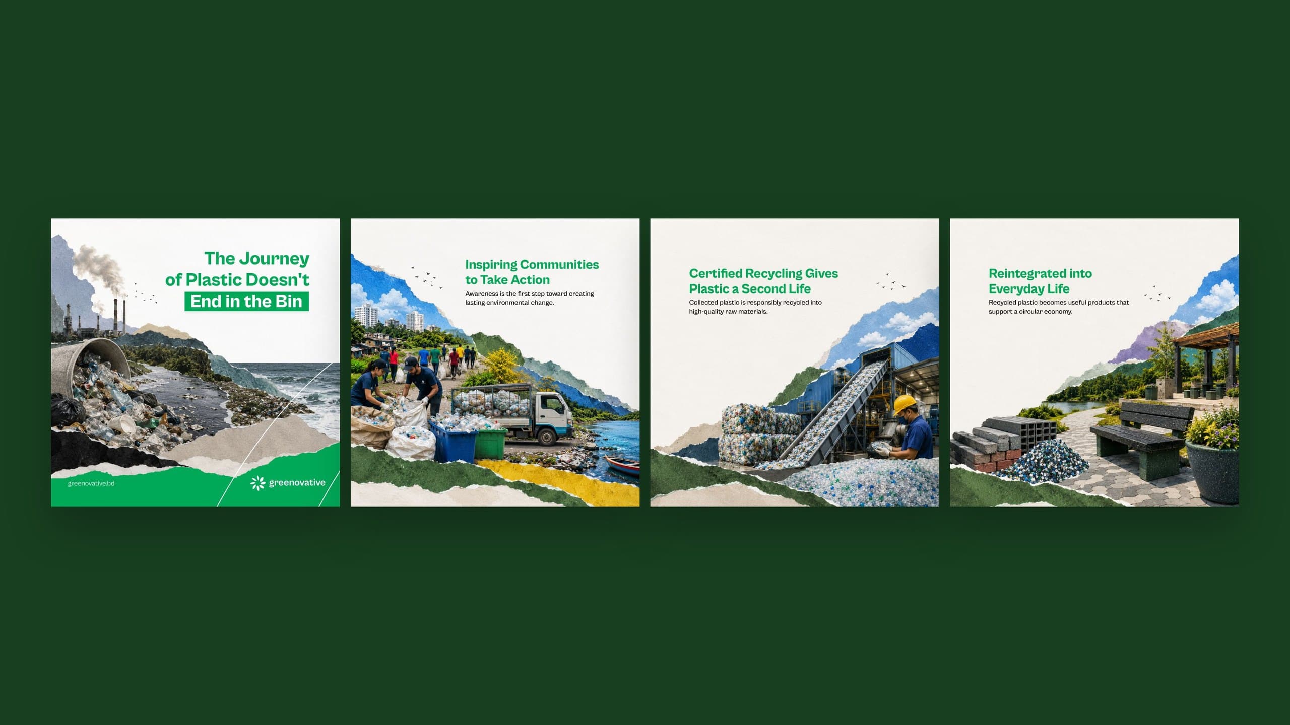
For launch, we built a story-led carousel that follows plastic from the bin to the river, into community collection, through certified recycling and back into parks, benches and bricks. Torn-paper collage layers stitch each frame to the next, so the series reads as one continuous landscape. Bold data posts, sourced from the OECD, give the campaign its urgency.
09 · In the world
From letterheads to collection bins.
The identity extends to stationery, business cards and a colour-coded signage system for collection points. Each plastic stream gets its own palette colour and number, making sorting simple for anyone, at a glance.
The result
Reclaim. Reinvent. Reimagine.
Greenovative now has a brand as optimistic as its mission: a mark built from waste that looks like growth, and a system ready to scale from a single post to a national movement.
Brand identity, website and social by Makers Creative Agency.
Next project
Palmal Group
Photography and film across 25+ factories, in one visual language.